RVO Health: Internal Comms
Expertise:

Overview:
RVO Health is a leading digital health company that helps millions of people make informed health decisions through trusted information, tools, and services. Formed in 2022 from a partnership between Red Ventures and UnitedHealth Group’s Optum, RVO Health owns well-known brands like Healthline, Medical News Today, Healthgrades, and Optum Perks.
As a designer at RVO Health, I focus on creating visual assets that support internal communications across the company. Working closely with the HR and marketing teams, I design materials like presentation decks, blogs, social banners, LinkedIn assets, email graphics, digital posters, event visuals, onboarding materials, and templates for recurring internal use.
Outcome:
s a designer at RVO Health, I create visual assets that support internal communications across the company. Working closely with the HR and marketing teams, I help bring clarity and consistency to employee-facing messages, whether it's for company updates, culture initiatives, or internal campaigns. My goal is to make communication feel engaging, clear, and aligned with our brand.
Credits:
My Role:
Sanchez Stanfield, PH Oster, Alexis Lira, Megan White
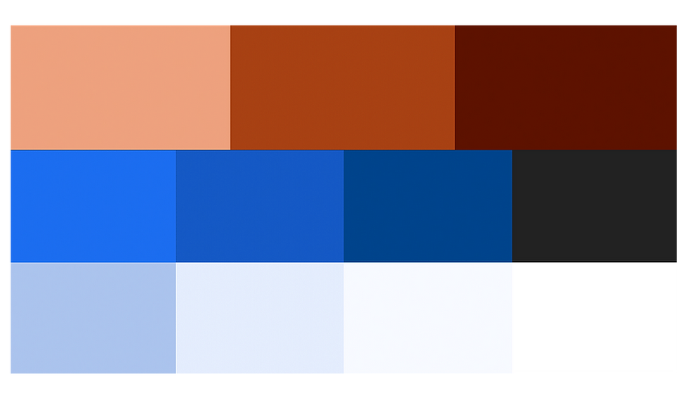
The color palette was built around hues of blue commonly associated with medical technology tones that signal trust, clarity, and innovation. We expanded this foundation with supportive neutrals and subtle accent colors to add warmth and flexibility across use cases. Together, the palette feels clean, modern, and tech-forward while still maintaining the sense of care and reliability essential to the brand.
Color Palette:
The RVO Health logo is one of the most important components of our brand identity. Its geometric letterforms lay the foundation for our entire visual system, establishing a connection that is dynamic, approachable, and innovative.
Color Palette:


My team and I created a set of brand signal icons, expressive visual markers that represent key ideas, themes, and actions within the Collage brand. These icons were designed to bring clarity and personality to internal content, appearing across blogs, newsletters, presentations, team updates, and culture-building materials. We established a consistent visual language rooted in Collage’s style, exploring shape, line, and motion to ensure each icon felt intentional and instantly recognizable. The final system gives teams an easy, unified way to communicate information while reinforcing a strong sense of brand identity.
Broad Brand Signals:


Doing/Disrupting Business
Being/Experiencing Team
Portrait Collages:
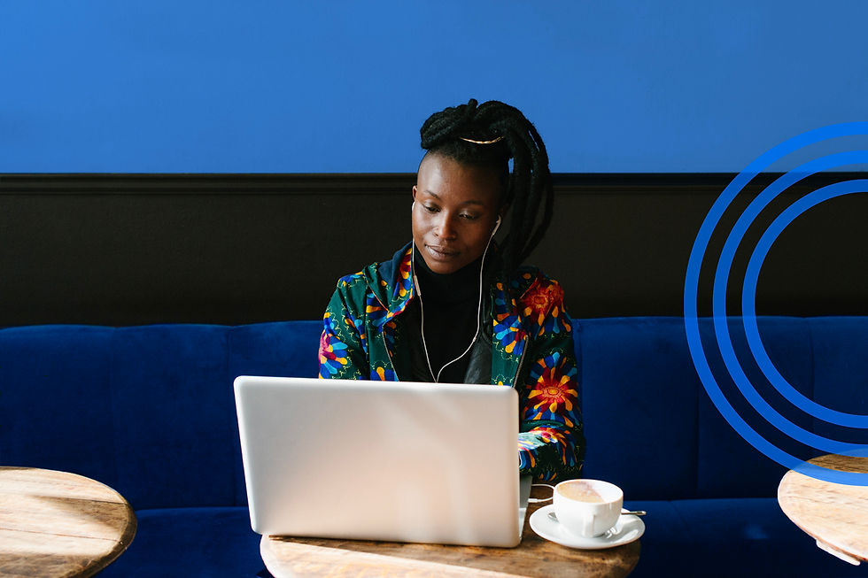
Designed a portrait-style photo collage that uses the brand signals as expressive accents. By layering icons, shapes, and motion elements around team photos, we created a dynamic visual for presentations, milestones, and internal mentions. This collage format brought a more human, celebratory feel to everyday communications while reinforcing the brand.


Editorial Collages:


We also created editorial-style photo collages that used the brand signals to visually represent themes and concepts for blogs and articles. By blending imagery with expressive icons, shapes, and textures, these collages brought narrative depth to content and made complex topics feel more approachable.


Purpose:
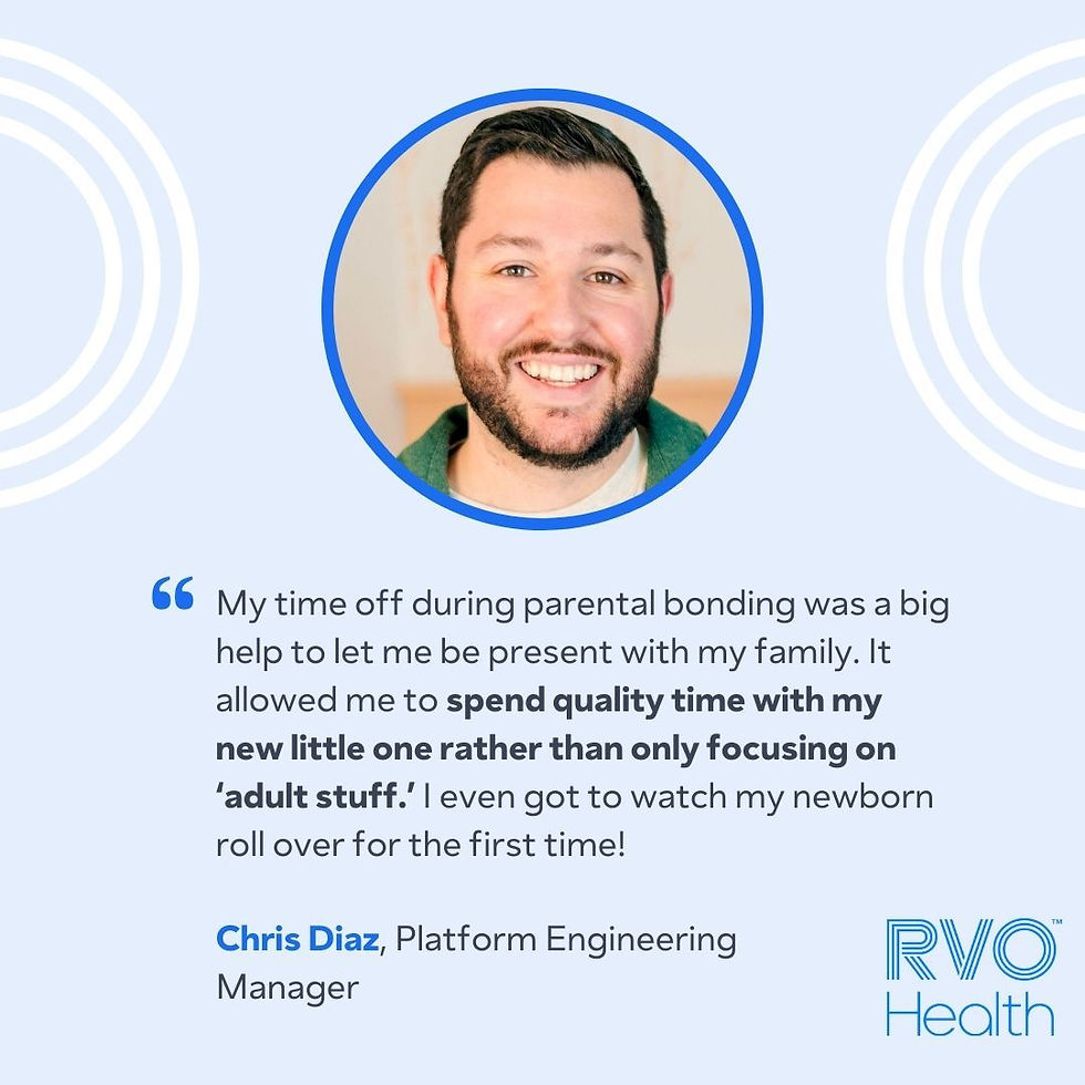
These assets were created for internal purposes, ranging from branded email and newsletter graphics to intranet visuals, infographics, and icons. I also developed materials to support culture and campaign initiatives such as posters, event banners, recognition templates, and motion graphics, along with practical assets like report layouts, virtual backgrounds, and signage, all designed to keep communications clear, engaging, and on-brand for employees.


Impact:
These visuals have supported smoother rollouts of internal initiatives, improved participation in company programs, and helped maintain a consistent, trusted brand experience within the organization.