Optum Store: Growth Marketing
Expertise:
Overview:
Optum, Inc. is an American healthcare services provider with business interests encompassing technology and related services, pharmacy care services and
various direct healthcare services.
Outcome:
The project delivered a design system and style guide with templates for graphics, social media, and web visuals, aligning with Healthline’s refreshed brand. This scalable system cut content production time by 20%, improved brand recognition by 15%, received positive feedback, and built user trust with consistent, approachable design.
My Role:
I worked closely with the creative director to design and animate various social media graphics, digital ads and print materials for marketing. Also storyboarded and animated weekly graphics for various social media platforms, designed evergreen modules for digital advertisements and e-newsletters, and created direct mailers, sell sheets, and other printed materials.
Credits:
PH Oster, Alexis Lira, Sanchez Stanfield, Jay Jung

The Challenge:
Optum Store’s existing ads felt outdated and visually inconsistent across campaigns, making it difficult to create a cohesive brand experience. The challenge was to refresh the visual direction while building a scalable system that could support different products, promotions, and campaign needs. The new approach needed to feel more engaging and relevant while remaining flexible enough for ongoing production.

Goal:
Create a modern, cohesive ad system that strengthened the Optum Store visual experience and made paid content more engaging. The goal was to establish flexible design principles, layouts, and visual elements that could be adapted across campaigns while keeping messaging clear, products easy to recognize, and the overall experience consistent.

Process:
Our team used A/B testing to refine designs based on real performance data. We tested variations in layout, color, and imagery to see what drove the most engagement. By analyzing results, we made informed design decisions that enhanced user experience and effectiveness.
Version 1

Version 2
Both ads share one goal , get users to click Shop Now as part of Optum's summer campaign, encouraging people to prioritize their health and protect themselves through the season. They just test two different levers to get there: engagement vs. conversion.

This one fixes that problem, it's down to one hero product, one clear price ($9, framed as "Best Skin care"), and a simple, benign headline that echoes the therapy ad's proven format. "Protect your skin from the sun.
We've got you covered."is a direct, reassuring value prop with no wordplay to decode. This is the stronger ad: single product, single price, single message, same low-friction structure that made the therapy ad effective, now applied to sun care.
This version still splits attention across three products with no price attached, so the punny headline has to do all the work of grabbing interest while the viewer is left to figure out which product is actually the offer.
It's visually lively and on-theme for summer/social media, but the lack of a single, priced hero product means the CTA has less to anchor to.
Emails:
We designed ads for email campaigns, creating cohesive visuals that connected promotional messaging with the broader campaign look and feel. Developed flexible creative variations with clear hierarchy and engaging imagery to keep the experience consistent across email and advertising touchpoints.


Ads:
Developed scalable paid ad systems with the team, designing flexible layouts that could support multiple message and visual variations. I refined composition, type, and CTA emphasis through A/B testing to improve performance while preserving a polished, on-brand look.


Social:
Created platform-specific social designs built to stop the scroll, using bold composition, brand-forward color, and adaptable templates. I optimized layouts for different formats and placements while maintaining a cohesive visual language across channels.


Direct Mail / OOH:
Extended the digital visual system into physical spaces by designing high-impact direct mail and out-of-home assets. I focused on legibility, hierarchy, and brand presence at a distance, ensuring messaging remained clear, accessible, and consistent across print environments.


Internal Comms:
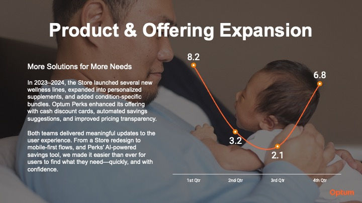
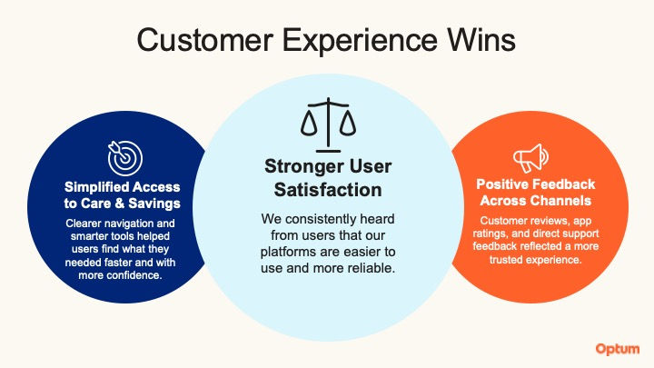
Designed branded internal presentations and decks for Optum to communicate key initiatives, updates, and strategic information across teams. Translated complex information into clear, engaging visual narratives while ensuring each presentation aligned with Optum’s established brand guidelines, visual language, and overall communication standards. Created polished, consistent layouts and visual systems that helped internal teams communicate information effectively and maintain a cohesive brand experience across internal communications.